top of page


Alex

shilts
-Work in Progress: Aesthetics-

The Millennial Stone
Team Lead / Lead Programmer / Level Designer
2D Platformer || Unity 4.5 || 5 developers || 2 months

USER INTERFACE DESIGN
All of The Millennial Stone's UI focused on being as non-intrusive to the player experience as possible. The HUD and Menus are simple, and several UI elements were built straight into the game world to prevent a break in immersion.
The Menus
The Menus
Scroll down for-
-all the UI details

The menus in The Millennial Stone are very lean, influenced by our minimal direct communication design goal. They give the player only what they needed to start the game or learn how to play, asking players to explore by the very nature of the presentation. They were also integrated as much as possible in the existing game world to create a smooth transition into the gameplay.
This section is primarily focused on the design and layouts of the Menus and HUD. For a full description of the UI's scripting implementation, head over to the Scripting section, linked here.
->The Main Menu
The Main Menu

This goal actually resulted in the main menu being built entirely into the first level of the game. This allows players to jump straight into the gameplay and story without a loading screen or any break in immersion. This decision ended up playing a huge role in selling our world to players early, as they are dropped in without context and not even told when they can move. They discover the game world at the same time and in the same ways as the main character.
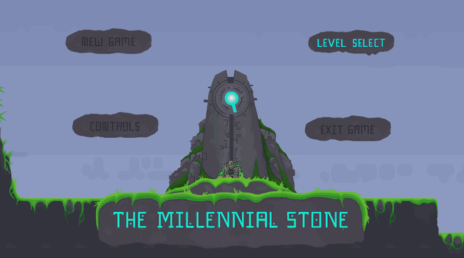
One of the primary design goals for The Millennial Stone was a seamless and hands-off player experience. As such, the Main Menu was designed to exist in the world of the game, instead of a removed seperate screen. The buttons pull up different screens and can be parallaxed by moving the camera, creating a sense of depth and presence.
->The Level Select Menu
The Level Select Menu

The Level Select menu served as a great way for players (and potential recruiters) to quickly access all of the game's levels and keep track of the Mural Orb collectibles they had found. Each level has a set of icons indicating which Orbs are missing/obtained as well as unique concept art associating the level with a special image and color scheme.
->The Pause Menu
The Pause Menu

The Pause Menu, designed to look like a slab of rock etched in energy highlighting the currently selected option, pops up in the center of the screen when the player pauses the game. It scales with the size of the Camera, so even if players pause when the camera is zoomed out for a cinematic, the menu is still the same readable size.
The Orb Inventory List, the 3 grey dots in the top left corner of the screen, fade in when the player pauses as well. These slots show the player which of the 3 Mural Orbs they have acquired in the current level. The slots also pop up whenever the player grabs a new Mural Orb to show the collectible floating into the correct slot.
bottom of page